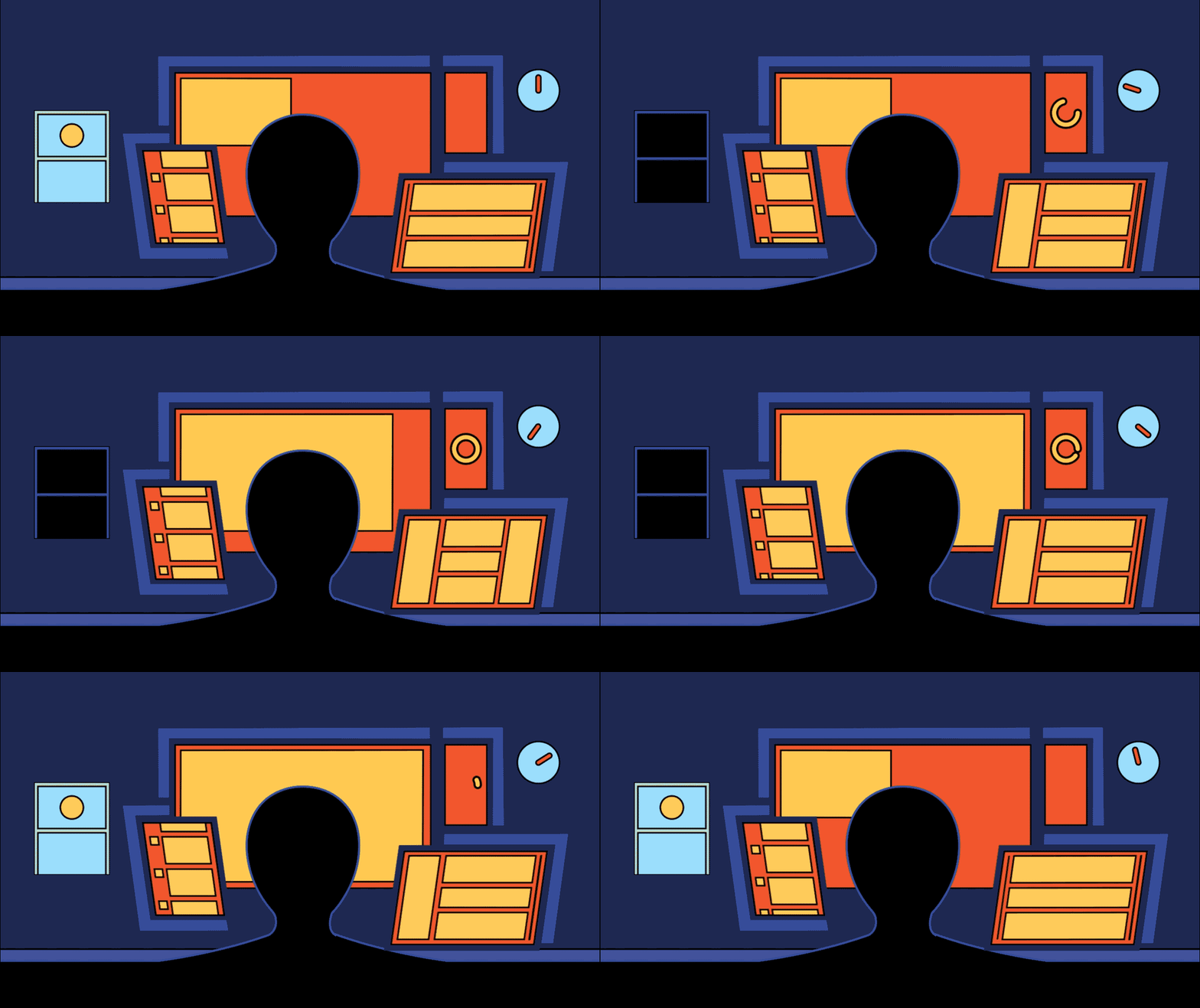
How to Remain A Successful Product Designer In Our Current Digital Hellscape

The internet is a scary place. I don’t just mean the internet in 2021, coming off the chaos-in-all-directions kind of year we just had; I mean the internet itself and the way we are bound to it, and our chosen devices on which to serve it up. The average millennial spends almost six hours per day in front of a phone. That number goes up to seven hours for most gen-z’s. We’ve all read the reports on the negative effects this has on our health. This is apart from the emotional toll, exposing ourselves constantly to Everything Going On in the world, enough that the word “doomscrolling” has entered our vocabulary—the steady stream of bright colors and bad news that we can’t get enough of.
To detach oneself from this is a tempting choice. You can do it for health reasons, or political reasons, or both. Several studies have been done examining the link between excessive screen time and depression (reasons beyond reading the news and comparing your life to those of your high school friends on Facebook). There is a trend of children who grow up using tablets and laptops getting lower test scores in thinking and language areas. You can become legitimately addicted to the dopamine blasts in your brain from interacting with your bright and shiny screen. I can continue, but we’ve all likely seen these kinds of reports. In the end you may ditch your smartphone for a burner (or a sleeker version like the Light Phone), dig out your iPod for unconnected music, or set a daily screen time limit on your devices. You may find the need to delete your accounts on certain products after a CEO does some shady behaviors, or you start to disagree with their policies, or due to their impact on the world and the environment. Many have found the obvious bliss of ungluing from our screens and looking up.
But!
As digital product designers, this is a much tougher feat to accomplish. Our jobs are designing the experiences for these devices; to be successful, we need a deep understanding and plenty of practice using them. It would be like if I was a car designer who had built a successful career designing cars, who one day decided to quit driving cars. I wanted to save myself the costs, the risk of injury, the toll on the environment. But I still want to work designing cars. As the years go by, keeping or finding a job would be harder and harder. I’m no longer a user of the thing I’m designing. I have little awareness of the current trends or new technologies that other car companies are using.
No matter how much we designers want to unplug, we still have a duty to keep our fingers in our devices, if only to keep our designs (and our employment) relevant. We need to know about any new fun new navigation styles that are catching on, what the next design trend will be (Remember neumorphism? Where did that go? Did it ever get off the ground at all?) Are there design changes at the operating system level that inform the design of the apps that run on it? Are there patterns that have been proven unsuccessful that need to be replaced? A large part of maintaining a delightful experience is keeping it “fresh” in the world it lives in.
Staying Sane
Among these restraints, there are things we can do to keep experiencing our digital world in a healthy way, without cutting off entirely from it.
Create a shared “inspiration library” with your team
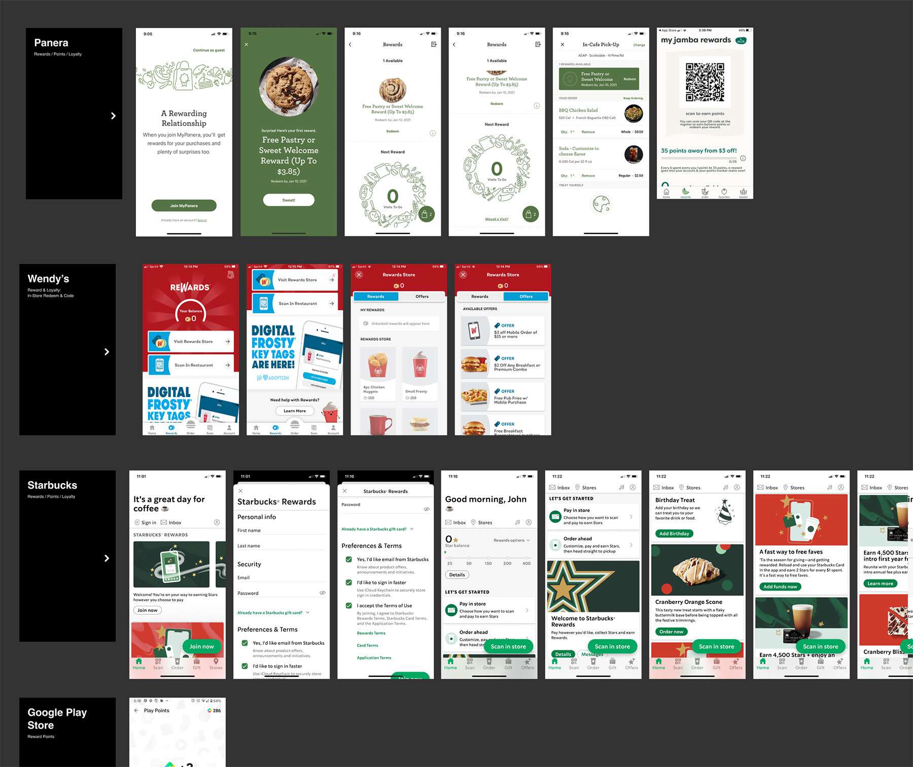
Research is a huge part of the product design process. If you’re designing a podcast app, it’s normal to spend days or weeks analyzing every competing app out there. You’ll download every other podcast app in the app store (ok, maybe not all of them). You’ll look at music apps. Hell, you’ll even download TikTok, to see whatever is going on over there. You’ll take screenshots, annotate them, stick them into your whiteboarding tool of choice. This doesn’t have to be a solo task though. I have had success setting up shared documents to house all of these inspirations and competitive audits. In one example I was working with a director who spent a LOT of time researching similar products to the ones we were building; he would drop screenshots and comments in Slack to discuss in the moment, then they went into a shared Figma file. Screenshots were organized by both brand and feature. This was a living document beyond the research phase; new items were constantly being added. When it came to improving a feature, we had a bank of images of competitors doing a similar feature at the ready.

Collecting competitors’ loyalty program screenshots
Team show and tells
Another useful idea is to hold a weekly or monthly time with your team to show off things you’ve found that you think are cool. It could be a website or app that is well done in its entirety, a nice new typeface, a fancy menu transition, or a cool illustration style. Or a bad illustration style. Calling out the things we don’t like is just as important as noting the things we admire. Many minds are more powerful than one—rely on your colleagues to keep everyone informed.
External resources
Along with doing your own research, there is a wealth of competitive data on the internet. Here a few worthwhile sources to spend some quality time with:
Some of these even have email newsletters. Even better!
Timebox yourself
The most obvious one might be to simply limit your screen time in a more manual way. Keep your research to working hours. Resist the urge to keep playing with them and analyzing them after hours. Resist the urge in general to be on-screen at all hours. Set a time each week to go through all your email newsletters so you can really focus on them. Turn off most of your notifications. Put a screen time limit on your phone. While you’re at it, keep your phone outside of the bedroom to prevent the hours of scrolling and blue light beaming into your brain before going to sleep.
The bigger goal above this is to be more intentional with your plugged-in time. For the past few years I have set small rules for myself: the laptop stays in the office, the phone sits on its charger in the living room as much as possible (after 10pm being the “curfew”), the iPad is used 90% for making art (the reason I bought it), etc. I noticed quickly how much I started to value that time on-screen and wanted to do quality things with it. If I limit myself to one more hour on my phone today, should I spend it in the bottomless pit of Twitter, or play more Two Dots levels (I had to stop myself at 2000)? Or how about I learn something or create something new?
What Works For You?
Everything is collaborative. Do you have other tactics that you’ve found to work? Tweet us at @formidablelabs if you have insights to share.
PS: A bigger, separate topic is the responsibility of us designers to create products that don’t lead to screen addictions and overuse in the first place. We don’t need to keep measuring success based on how long we can keep someone’s eyes locked in. How can we protect our users, digitally and holistically? A book called The Best Interface is No Interface is a good read on this.
PPS: On the larger topic of improving your relationship with technology, the Center for Humane Technology has put together many more resources and strategies, along with tactics for building healthy digital products for humans.


